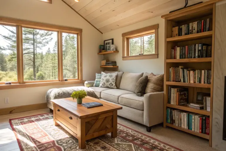
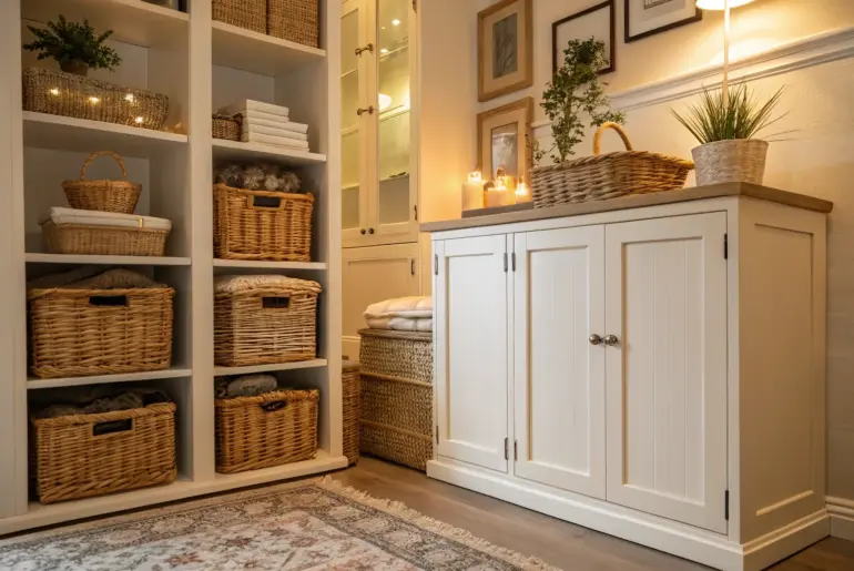
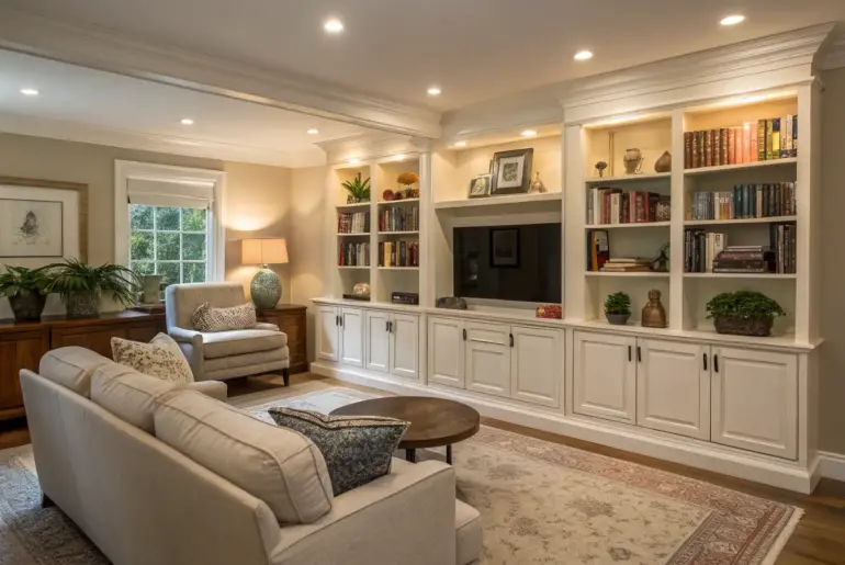
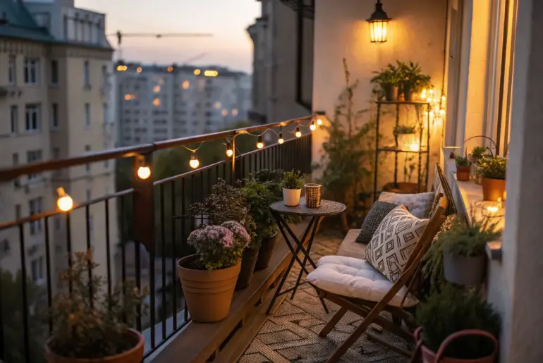
Every beautiful room rests on one simple principle: proportion comes before decoration. Decoration adds personality; proportion creates harmony. Without it, even the most curated interiors lose their rhythm.
What Proportion Really Means in Design
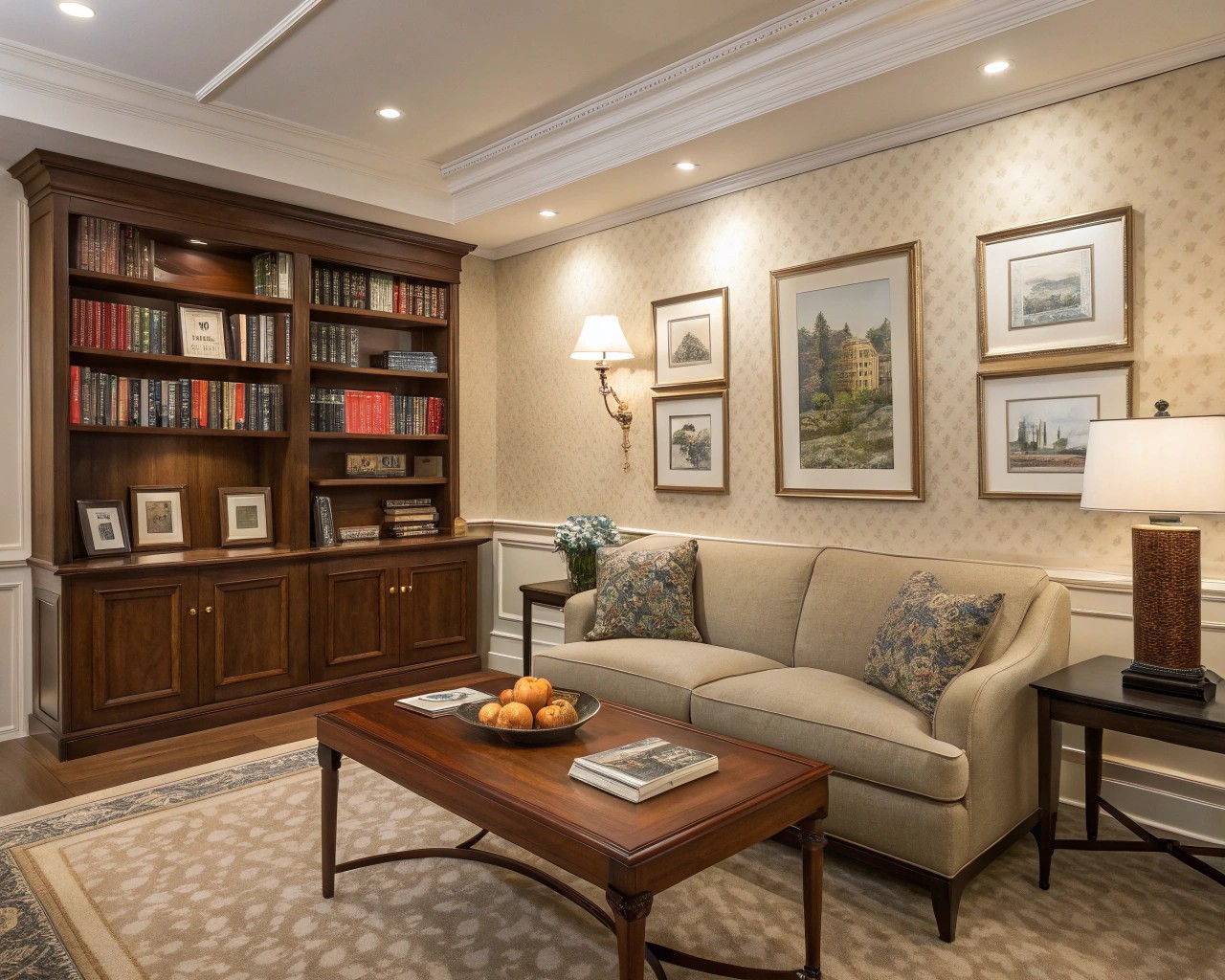
Proportion isn’t a stylistic choice—it’s the spatial logic that ensures comfort and cohesion. It’s the relationship between things: furniture to room, objects to walls, art to negative space. Get these relationships right, and almost any interior feels balanced.
When proportion fails, even the highest-end décor can look awkward. A perfectly polished brass lamp looks off if it towers over a small end table. A bold rug loses impact if it’s too small beneath generous seating. Proportion is not about aesthetic rules—it’s about visual and physical comfort.
Good proportion supports every decorative decision, the way structure supports skin.
Reading a Room’s Architecture
Before layering color or texture, read the architecture. Every room, however simple, has invisible lines—its eye level, symmetry points, and volume of air. Seeing them clearly helps you design with structural awareness rather than rely on décor alone.
- Ceiling height: Lower ceilings favor slimmer furniture and lighter materials to preserve openness.
- Wall length: Large or unusually long walls can anchor major pieces—sofa, credenza, or bed—if those pieces occupy roughly two-thirds of the length.
- Windows and light: Align seating and focal points with natural light. Daylight subtly shapes the room’s proportions and mood.
- Negative space: Treat empty zones as design tools. Open surfaces allow the eye to rest and affirm the scale of the objects you include.
Try standing in the doorway and tracing invisible “relationship lines” from large furniture toward walls, windows, and ceilings. You’ll start to see where the balance leans—and where it’s missing.
The Mathematics Behind Harmony
Mathematics and interior styling are closer than people realize. Designers often rely on ratios that naturally please the human eye, like the Golden Ratio (1:1.618) or the simpler 2:3 rule.
Some quick references:
| Relationship | Ideal Ratio | Design Effect |
|—————|————–|—————|
| Sofa : Wall length | 2:3 | Keeps visual grounding without crowding |
| Coffee table : Sofa length | 2:3 | Feels proportionate for surface use |
| Side table : Sofa arm height | 1:1 | Functional reach, clean geometry |
| Rug : Seating cluster | 1:1 to 2:3 | Defines zones intuitively |
| Artwork : Wall span | ~0.57 (Golden Ratio) | Balanced visual weight |
These formulas aren’t commandments—they simply echo natural ratios found in nature, architecture, and even the human body. That’s why they look right.
Balancing Scale and Visual Weight
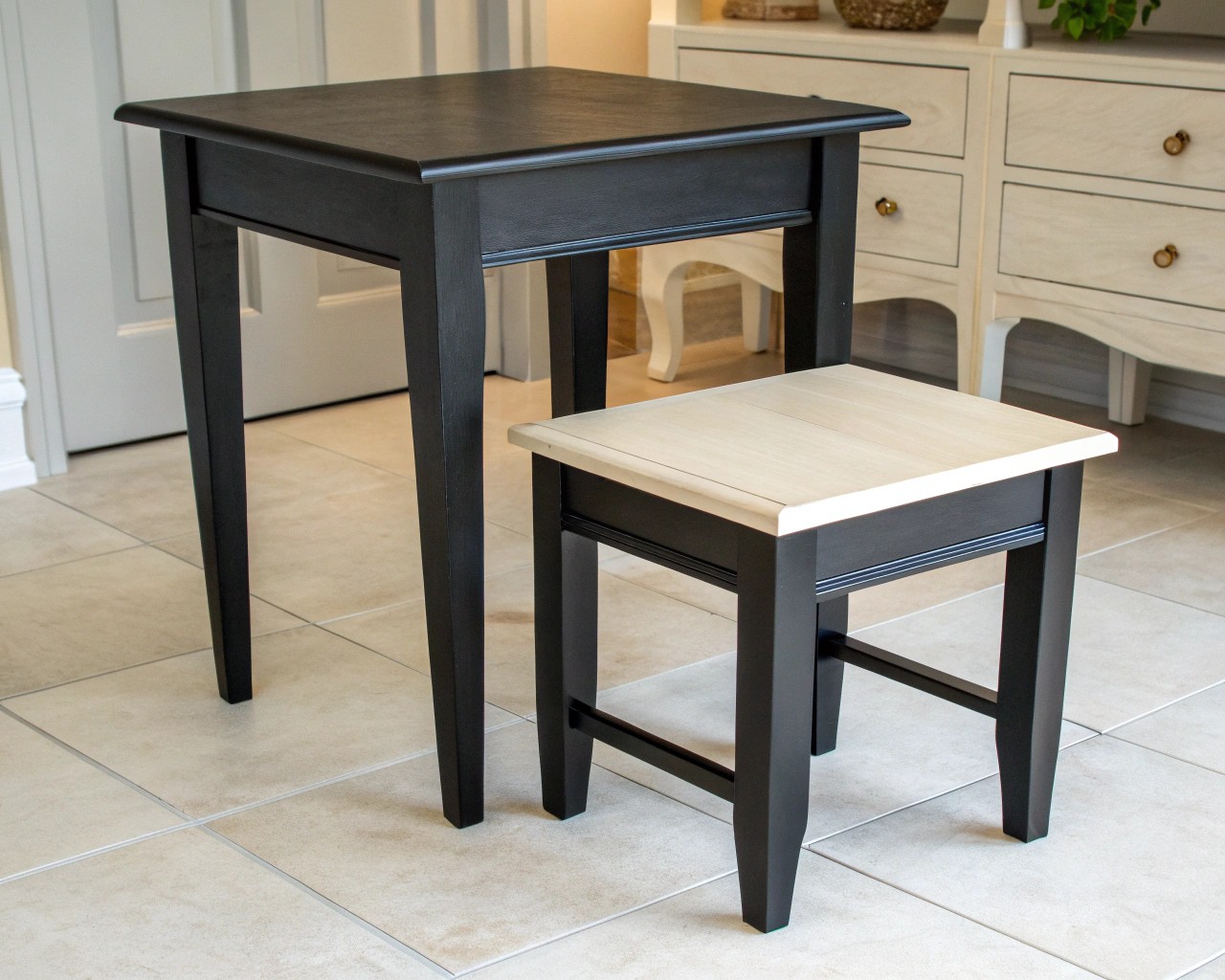
Scale expresses how objects relate to human dimensions; visual weight refers to how bold or light an element feels. A small black table can seem heavier than a larger one in pale oak.
Harmonizing both brings dimensional richness to a room.
Try this method:
1. Start with one anchor—sofa, bed, or dining table.
2. Layer by thirds: Flank with mid-scale objects (chairs, lighting), then accent with smaller pieces or open surfaces.
3. Mirror “visual weight”—if one side holds a heavy bookcase, balance it with height or substance on the opposite side (a tall plant, mirror, or hanging textile).
Balance doesn’t mean symmetry—it means even distribution of energy and form.
The Supporting Role of Decoration
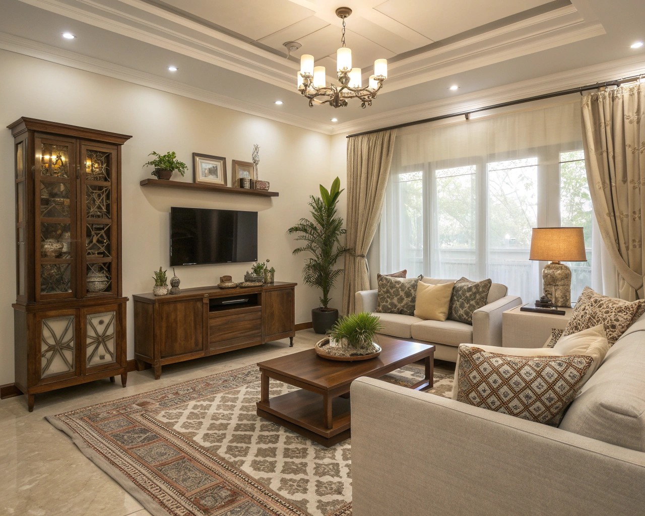
Once proportion feels right, decoration can truly shine. Accessories, art, texture, and color are emotional layers, but they must follow the room’s proportional rhythm.
Guidelines worth remembering:
- Go large where scale allows. Big walls, big gestures—large artwork or one commanding mirror—are more confident than many small frames.
- Work in odd numbers. Groups of three objects (of varying heights) look deliberate, not staged.
- Mind border zones. Leave a few inches between sofa and wall or rug and molding; borders define breathing room.
- Let textiles echo structure. A rug aligned with sofa edges or curtain folds aligned with window frames signals proportion through repetition.
Decoration never compensates for poor relationships between size and space—it only highlights them. When layouts feel awkward, simplify and adjust scale before adding décor.
Applying Proportion in Small-Space Design
In compact homes—urban apartments, converted studios, or narrow bedrooms—proportion becomes precision work. Small spaces punish excess but reward clarity.
To expand perception without clutter:
- Use verticals. Mount curtains well above the window frame to elongate walls.
- Choose one statement piece. A single grand sofa or oversized pendant commands presence more gracefully than several undersized items.
- Layer light at different heights. Overhead, wall, and table lighting shape spatial depth and simulate taller ceilings.
- Float furniture. Pulling pieces a few inches from the wall creates micro-shadows that make space feel more generous.
Compact interiors thrive on rhythm—you want the same visual pacing as in a larger home, only tighter and smarter.
Emotional Geometry: How Proportion Feels
A proportioned interior doesn’t just look balanced—it feels right. The geometry of distances and scales influences our posture and mood. Wide table spacing invites conversation; chaotic clusterings make us restless.
I’ve learned to trust that subtle body-language response. When you walk into a well-proportioned room, your breathing steadies, your shoulders drop, and the space welcomes you. That, more than decoration, is what comfort really is.
Decoration pleases the eye. Proportion soothes the body.
Practical Checklist for Everyday Styling
Before adding or buying anything new, run through a quick proportion audit:
- Does furniture length fit the wall behind it with breathing space?
- Can you pass comfortably between major pieces (at least 30 inches)?
- Is there visual balance between left and right sides of the room?
- Are accessories grouped in consistent heights or sizes?
- Does light reveal the shape of the space, not just its color?
Refining proportion often costs nothing—just observation, rearrangement, and restraint.
In the End: Quiet Logic Over Surface Beauty
Good interiors aren’t assembled; they’re tuned. The beauty in proportion lies in its invisibility—it’s the silent geometry that gives a room dignity.
When we understand that decoration only amplifies structure, we begin to design with logic, not just taste. And that’s where truly livable, timeless interiors begin.

